How to Create High-Converting Landing Pages That Actually Drive Sales
Learn how to create high-converting landing pages that actually drive sales using proven conversion tactics, persuasive copy, trust signals, user psychology, CTAs, and advanced optimization strategies.
Brand Boost
12/2/20254 min read
How to Create High-Converting Landing Pages That Actually Drive Sales
A high-converting landing page isn’t just about nice visuals—it’s about persuasion, clarity, psychology, and purpose. Whether you're running paid ads, email campaigns, or organic marketing, the landing page is where traffic becomes revenue.
In this guide, you’ll learn how to create high-converting landing pages that actually drive sales, rooted in marketing psychology, UX best practices, and proven conversion strategies.
Understanding What Makes a Landing Page “High-Converting”
At its core, a high-converting landing page must:
Communicate clear value instantly
Direct the user to one singular action
Remove friction and confusion
Build trust through credibility
Guide the visitor psychologically toward the purchase decision
Step 1: Define One Clear Objective and Audience Persona
Before designing anything, ask:
Who is this landing page for?
What problem are they experiencing?
What solution am I offering?
What is the one action I want them to take?
Examples of single objectives:
Buy now
Sign up
Book a call
Request demo
Download free guide
If your landing page tries to do multiple things, your conversion rate drops.
👉 One landing page = One objective.
Step 2: Craft a Powerful and Benefit-Driven Headline (H1)
Your headline must answer:
What will I get, and why should I care?
Bad: We sell digital tools.
Better: Increase sales by 300% with AI-powered digital automation tools.
Characteristics of high-converting headlines:
Value-focused
Benefit-driven
Short, clear, impactful
Use keyword prominence by including your focus keyword near the beginning when possible.
Example:
High-Converting Landing Pages That Increase Sales Instantly
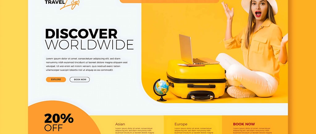
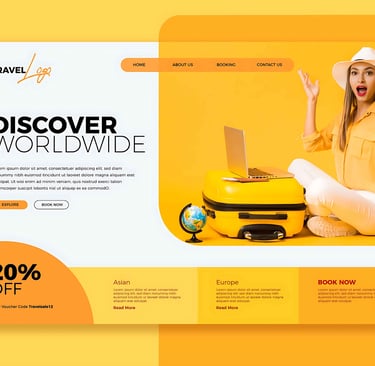
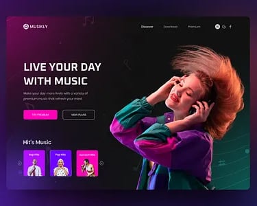
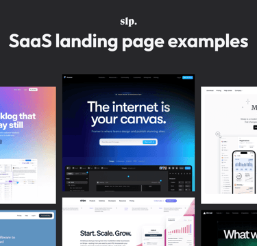
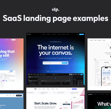
Step 3: Use Hero Images and Visuals That Support Messaging
Your visuals must not be decorative—they must reinforce the message.
Examples of strong alt text for SEO:
alt="High-converting landing page for SaaS software"
Avoid empty generic alt text like:
❌ alt="image"
Good visuals build trust and provide clarity.
Step 4: Use Persuasive Copy Driven by Emotional Triggers
The psychology of conversion relies on:
Pain → Solution
Problem → Promise
Before → After transformation
Instead of describing features, sell transformation.
Example:
Feature: Includes 50 SEO templates
Benefit: Write SEO-optimized content 5X faster
People don’t buy products—they buy better versions of themselves.
Step 5: Build Trust with Social Proof and Credibility
Forms of trust signals:
Real customer testimonials
Case studies
Data-based results
Real photos of customers
Press mentions
Industry certifications
Money-back guarantees
Example social proof statement:
“Used by over 7,000 businesses and trusted by Fortune 500 companies.”
Social validation reduces cognitive hesitation and boosts conversion.
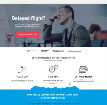
Step 6: Create a Clear, Compelling, and Actionable CTA
Your CTA must be
Visible
Benefit-oriented
Urgency-based
Singular
Examples:
Get Started Now
Claim Your Free Trial
Book Your Strategy Call
Download Now—Free
Use contrasting colors for buttons so they stand out visually.
Step 7: Optimize for Mobile-First Experience
More than 60% of traffic is mobile for most websites. A high-converting landing page must:
Load in under 2 seconds
Display key content above the fold
Have large buttons for fingertip tapping
Simplify layout—avoid clutter
Mobile visitors are less patient. Fast and simple = higher conversions.
Step 8: Leverage FOMO, Urgency, and Scarcity (Ethically)
Psychological triggers like
Countdown timers
“Only 3 spots remaining”
“Limited-time discount—expires midnight”
must be real, not manipulative.
Urgency accelerates decision-making.
When used correctly, conversions can increase significantly.
Step 9: Remove Friction and Objections
Ask yourself:
What is stopping someone from clicking “Buy”?
Examples of friction:
Too many form fields
Unclear pricing
No refund info
Hidden fees
Unanswered FAQs
A great FAQ section eliminates hesitation.
Example:
Q: Can I cancel anytime?
Yes—no contracts, no hidden fees.
Step 10: Use A/B Testing and Data-Driven Optimization
Never assume—measure and test.
Elements to A/B test:
Headline
Button CTA text
Button color
Hero image
Testimonials format
Layout arrangement
Price display format
Data beats guesswork. Optimization is continuous—not a one-time task.
Internal Linking Strategy (Important for SEO)
Example internal links for your site (Brand Boost):
Link to your Services page using:
“Learn more about our landing page optimization services on our Services page.”Link to related blogs:
“If you want to understand Google ranking better, read our blog on Understanding Google’s Algorithm Updates.”
Keep internal linking relevant and contextual.
Outbound Linking Strategy (for authority & credibility)
Link to credible external sources in a new tab:
Example:
Research shows that reducing form fields can increase conversions by 120% (source: HubSpot).
Set outbound links to open in a new window (target="_blank") to keep users on your site.
Common Landing Page Mistakes That Kill Conversions
Too much text
Too many options
Vague headlines
Weak CTA
No proof or credibility
Boring visuals
Unclear value proposition
Not optimized for mobile
Confusing user flow
Avoiding these mistakes alone improves performance dramatically.
Bonus: Ideal Landing Page Layout Structure (Proven Conversion Flow)
Powerful headline (H1)
Supporting subheadline (H2)
Hero image + CTA button
Benefits section
Features section
Social proof
Guarantee/Risk reversal
CTA repeated
FAQ
Final CTA
Follow this structure and your conversions will improve.
Final Thoughts: Your Landing Page Is a Salesperson
When done correctly, a landing page works like a 24/7 salesperson:
It greets the visitor
Answers objections
Provides clarity
Builds trust
Sells value
Encourages action
Creating high-converting landing pages that actually drive sales is a blend of psychology, UX design, marketing messaging, and iterative optimization. The more you focus on the user’s intent and emotional journey, the more sales you will generate. Contact us to Create high-converting landing pages that actually drive sales


Address
11, 18th Main Road,
BTM Stage - 1,
Narayangowda Layout,
Taverekere, Bangalore,
KA - 560029
Important Links
Leave Details

All Rights Reservered.